
In manufacturing, having clarity behind production events and operations is a necessity. As operations grow more complex and customer expectations rise, the ability to access and act on timely, accurate production data can mean the difference between maintaining a competitive edge and falling behind.
Data visualization unlocks clarity, helping manufacturers identify issues, track trends, and make confident, informed decisions.
This post is the first of a series that highlights examples exploring how manufacturing organizations can effectively leverage data analytics and visualization to manage operations, monitor production performance, and control costs and variances.
From Static, Point-in-Time Data to Trends That Drive Action
Historically, much of the data available on the production floor has been point-in-time: a snapshot of a machine’s current output, a single shift’s scrap totals, or the day’s labor information.
While useful, this approach is limited and often relies on being logged into production systems to view data or run reports. These manual reports often take considerable time to run and lack the broader context that helps diagnose and improve production operations.
Data visualization allows teams to go beyond static reports and instead quickly identify recurring issues and course-correct before they escalate.
Modern data visualization tools like Tableau, Power BI, and Sigma Computing can even have built-in workflows where users can take action from directly within a dashboard.
A well-designed analytics environment provides:
| Instant Access to KPIs | across key metrics, such as those pertaining to machine utilization, uptime, performance, and quality. |
| Early Warning Signs | when labor overruns, material variances, or recurring downtime start to emerge. |
| Historical Context and Trending Views | to highlight shifts in metrics over time, allowing teams to prioritize focus with confidence. |
Surfacing the Right Data Requires the Right Strategy
We cover the specifics of forming a data strategy here and we will discuss approaches for data architecture in manufacturing in a future post.
These efforts are necessary to lay the foundation for generating faster time to insight, so that your manufacturing team members across the organization can spend more time focused on the business and less time focused on running file exports and combining data in Excel.
Overall, improved time to insight drives faster, more accurate decisions, ultimately improving production performance, efficiency, and output quality.
Once Your Data is Properly Organized, It Can Be Visualized Through Purpose-Built Dashboards
Let’s dive into examples of data visualizations focused on key areas of the production and manufacturing industry, highlighting the potential use cases and benefits that these tools provide.
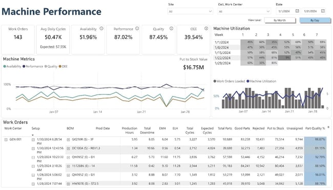
Use Case 1: Visualizing Production and Machine Utilization
Do you find yourself asking about the larger picture for how a machine performs beyond a single shift or work-order? By automating the extraction and compilation of data from manufacturing systems and surfacing in visualizations, this aggregated information can easily be viewed at any time.
Answering questions like these can be instant, without manual intervention:
- How does a machine’s output compare to forecast or BOM standards over several months?
- What is the actual cycle time vs. what was planned in a specified time period?
- Is the machine’s availability and uptime improving or declining over the last couple of months?
Interactive dashboards can visualize trends in availability, performance, quality, and downtime reasons. These longer-term visuals help uncover why specific events happen and how frequently they occur, helping team members diagnose deeper problems.
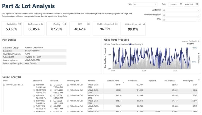
Use Case 2: Aligning Labor and Scheduling with Reality
Labor is one of the most controllable and visible aspects of production, yet it can still be difficult to manage. The right visibility into overtime, attendance, and operator training can help a team more effectively manage production shifts and work order scheduling.
Visualizations can help address important questions, such as:
- Are we meeting our scheduled production goals for the day or week?
- Did we run the BOMs we expected to run in a specified period?
- Is customer forecast data aligned with real order history, or are we over/underproducing?
Dashboards comparing labor forecasts to actuals help teams better allocate hours, reduce overtime, and improve job costing accuracy.
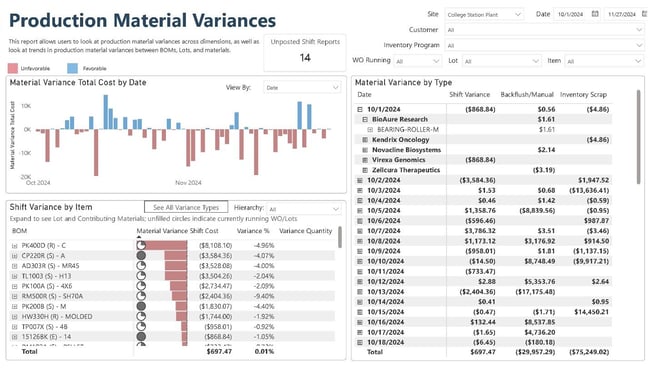
Use Case 3: Managing Variances and Scrap with Visibility
Production variances especially related to materials and scrap can erode margins quickly. Data automation and visualization empowers teams to:
| Identify the root cause of material variances | at the part, shift, or operator level. |
| Track total variance over time | for a work order or program, and determine whether it’s due to disposition, manual overrides, or input issues. |
| Highlight scrap rates across machines and timeframes | to uncover recurring inefficiencies. |
| Understand how much product is currently unassigned | and where it is located, removing costly inventory confusion. |
With this clarity, production and quality teams can work together to fix systemic issues and prevent future waste.
Gaining a Bigger-Picture Vision
Consider a machine’s output for a work order that runs for several days. You might see large variances or scrap numbers when simply looking in the production system at single shifts. When visualized and analyzed across the duration of the entire work order, though, you can see the resolution or persistence of these variances.
Staying at the shift-level keeps you focused on minute information that might not help diagnose the root cause. Moving to the broader trending view can surface patterns that reveal root causes, signal risks, and spotlight opportunities to reduce variances.
Data-Driven Manufacturing Starts with Clarity
The ability to visualize machine utilization, labor performance, scheduling accuracy, and production variances in real time, and over time, is no longer just a “nice-to-have” feature. It’s the foundation of modern, data-driven manufacturing.
By equipping your teams with the tools to see clearly, you empower them to act decisively, and that clarity turns into competitive advantage.
In upcoming blog posts, we will continue to explore the benefits and advantages of data visualization in the manufacturing industry by further investigating the use-cases of these tools within some of the areas highlighted above, including machine utilization and performance, schedule adherence, and variances across goods and services.
Ready to Explore Data Visualization for Your Operation? Count on SVA
As data analytics consultants, we’re a team of seasoned experts dedicated to helping manufacturing clients harness their data and transform it into a powerful tool for moving business forward.
We meet you where you are, supporting everything from planning and organizing your data to visualizing it through intuitive, beautifully tailored dashboards. From there, we can even unlock new possibilities by applying AI to rapidly accelerate processes and surface insights faster.
See how SVA can help uncover the critical insights you could be missing and turn them into competitive advantage.

Feel free to reach out to us at contact@svaconsulting.com
© 2025 SVA Consulting