<img height="1" width="1" style="display:none;" alt="" src="https://px.ads.linkedin.com/collect/?pid=1549393&amp;fmt=gif">

What’s new in data strategy and why it matters now

From the Data Desk

What’s New in Data, Analytics, and Visualization - and How to Use It

There is a natural tendency to treat a published number as finished. A report comes out, a dashboard refreshes, or a forecast is circulated, and that figure becomes the version everyone remembers. But many of the numbers businesses rely on are not quite that permanent. New records arrive, estimates are revised, definitions change, and a number that was accurate when it was published can look different a month later.

That gap between a number and its history is the thread running through this edition. We start with the latest U.S. employment report, where revisions to May and June changed the recent picture more than July's new estimate alone. We then step outside the platform-release cycle to look at three broader developments: how analytics tools are shifting the focus on the metrics they surface, how well today's data agents actually perform on messy real-world information, and why visualization researchers are paying more attention to uncertainty. We also highlight DuckDB, a lightweight tool for working with files that have outgrown the spreadsheet. In Actionable Insight, we bring the theme back to everyday reporting: what to do when a number changes after you have already shared it.

As always, the goal is clarity over coverage.

In the Data

The first number is not always the final story

If you follow a monthly economic report, you could reasonably assume the newest number is the main story. The July employment report is a useful reminder that this is not always the case. Many closely watched statistics are estimates, and those estimates can change as more complete information becomes available.

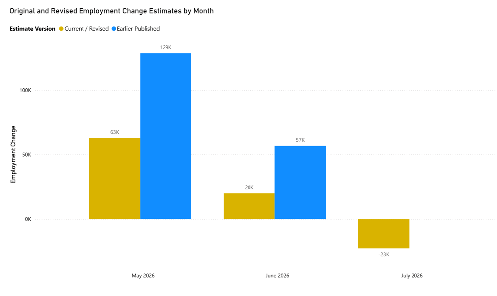
July payroll employment was reported down 23,000, while the unemployment rate edged down to 4.1 percent. But the more revealing change was behind the newest figure. Estimates for May and June were revised down by a combined 103,000 jobs. A reader looking only at July would miss a meaningful change in what the prior two months now tell us.

Chart

Put the earlier and revised estimates for May and June next to each other, followed by July, and the point becomes visible immediately. The chart is not simply showing three months of employment. It is showing how our understanding of those months changed as additional data arrived.

For business leaders, the implication is broader than employment data. Forecasts, operational estimates, survey results, and even internal KPIs can change as source data catches up. When a number is preliminary or has been revised, showing that history gives the reader something the latest value cannot provide on its own: context. A small label, prior estimate, or note about a revision can materially change how a chart is understood.

Sources:
• U.S. Bureau of Labor Statistics, “The Employment Situation - July 2026” (August 7, 2026)
(https://www.bls.gov/news.release/archives/empsit_08072026.htm)
• U.S. Bureau of Labor Statistics, “The Employment Situation - June 2026” (July 2, 2026)
(https://www.bls.gov/news.release/archives/empsit_07022026.htm)


In Data

Three developments changing how we think about analytics

1. Analytics tools are putting more emphasis on what happens after you see the number

A dashboard is good at telling you what happened. The harder question has always been what to do next.

Oracle's July 2026 update to Oracle Analytics Cloud offers a small but useful example of how analytics tools are trying to close that gap. The release includes improvements for comparing trends and changes over time, along with easier ways to create "data actions" that connect something a user sees in a report to another step or destination.

Neither feature is revolutionary on its own. What is more interesting is the direction. For years, dashboards have largely been destinations: open the report, review the numbers, and then move somewhere else to investigate or act. Increasingly, analytics platforms are trying to make that handoff shorter.

For business users, that could mean less time moving between reports and the systems where work happens. A sales manager who spots a change in performance, for example, should not have to start a separate investigation just to understand what changed or decide where to look next.

The useful question when evaluating analytics is therefore becoming broader than, "Can we build the report?" It is also worth asking, "What can someone do once they see it?"

Source:
• Oracle, What’s New for Oracle Analytics Cloud – July 2026
(https://docs.oracle.com/en/cloud/paas/analytics-cloud/acswn/index.html)


2. A new benchmark shows data agents still have plenty of room to improve

AI tools are getting better at answering questions about data, but a new 2026 benchmark offers a useful reality check. DataSpace tested leading models and agent systems on tasks where the answer had to be assembled from a mix of spreadsheets, databases, documents, and other files - much closer to the way information is actually scattered across an organization. The best-performing setup completed about two-thirds of the tasks correctly.

That result is encouraging and cautionary at the same time. These tools can already do meaningful analytical work, but they are not at a point where every answer should be accepted without review. For organizations experimenting with AI-driven analysis, the practical approach is to use it where the underlying evidence can be checked and where a person remains responsible for the final interpretation.

Source:
• Li, Boyan, et al., “DataSpace: Benchmarking Data Agents for Verifiable Analytics over Heterogeneous Workspaces” (August 4, 2026) (https://arxiv.org/abs/2608.03451)


3. Data visualization is paying more attention to uncertainty

A growing area of visualization research is focused on a simple problem: charts often make uncertain information look more precise than it really is. Forecasts, survey results, estimates, and projections all contain some degree of uncertainty, yet the finished visual may present a single line or number with no indication of how much confidence the reader should place in it.

Recent research argues that uncertainty does not have to mean adding complicated statistical graphics. For a non-technical audience, the better answer can be as simple as labeling an estimate, showing a reasonable range, distinguishing preliminary from final data, or explaining that a value may be revised. The goal is not to make every chart more complex. It is to avoid giving a reader more certainty than the data actually supports.

Source:
• Altimir, Nuria, “Engaging with uncertainty when engagement is uncertain,” Frontiers in Bioinformatics 6 (July 9, 2026) https://www.frontiersin.org/journals/bioinformatics/articles/10.3389/fbinf.2026.1801017/full


tool-highlight-header

DuckDB: When the file is bigger than the spreadsheet

Most business users do not need another database. They do occasionally run into a file that is simply too large or too slow to work with comfortably in a spreadsheet. That is the problem DuckDB is useful for. It is a free, opensource analytics tool that can work directly with common data files without requiring a traditional database server to be set up first.

Where that becomes useful

  • Opening and summarizing CSV or Parquet files that are too large or slow for a spreadsheet.
  • Exploring a new dataset before deciding whether it needs to be loaded into a larger data platform.
  • Combining several files and producing a smaller, cleaner result for reporting or visualization.
  • Supporting repeatable analysis when the same type of file arrives each week or month.

Imagine receiving several years of transaction data spread across files totaling multiple gigabytes. The business question might be simple - sales by month, product, or customer - but getting the files open can become the hardest part of the exercise. DuckDB can summarize or combine that data first, leaving a much smaller result to bring into Power BI, Excel, or another reporting tool.

That does not make DuckDB a replacement for a company's shared data platform, and it is not something every business user needs to learn. Its value is narrower and more practical. For analysts working with large extracts, prototypes, or recurring files, it can remove a surprising amount of setup between receiving the data and starting the analysis.

For leaders, the useful takeaway is simply that the size of a file does not necessarily need to dictate the size of the solution. Sometimes a lightweight tool is enough to get from raw data to a useful answer.

Sources:

Actionable Insight

When a number changes after you have reported it

A familiar reporting problem starts with a perfectly reasonable question: 'Why is this number different from the one I saw last month?' Sometimes the answer is an error. Often it is not. Transactions arrive late. Estimates are revised. Accounting periods close. Customer records are corrected. A source system catches up. The number changed because the information behind it became more complete.

The challenge is not preventing every number from changing. It is making the change easy to understand. When an important figure is updated after people have already seen it, communicate four things:

1. What changed?
Show the previous value and the current value together. If a reader remembers 57,000 and the report now says 20,000, do not make them wonder whether they misremembered it. A simple 'previously reported: 57,000; revised: 20,000' resolves the first question immediately.

2. By how much did it change?
Make the size of the revision visible. In the employment example, June moved down by 37,000 jobs. Showing the difference helps the reader judge whether the revision is minor or whether it changes the story they took away from the original report.

3. Why did it change?
Use plain language. Was more source data received? Did a period close? Was a duplicate corrected? Did the definition change? The explanation does not need to describe the underlying data process in detail. It only needs to tell the reader whether the change is expected, corrective, or methodological.

4. Does the change affect the decision?
This is the question reporting often leaves unanswered. A revised number may be different without being decision-changing. Or it may cross a target, alter a trend, or change a forecast. If the revision affects how the business should interpret the result, say so. If it does not, that is useful context too.

For any recurring report where important numbers can change after publication, decide in advance how revisions will be shown:

  • Keep the prior value available when a meaningful revision occurs.

  • Label estimates, preliminary figures, and revised figures clearly.

  • Show the size of a material change rather than making readers calculate it themselves.

  • Add one sentence explaining the reason when the cause is not obvious.

  • Call out whether the revision changes the conclusion or action.

This does not require a new dashboard or a complicated audit trail. Often a small note, a prior-value label, or a short revision history is enough. The important thing is that the reader can distinguish 'the data changed' from 'the report was wrong.' That distinction builds trust rather than weakening it.


CLOSING

The through-line of this edition is that data is often more fluid than the finished chart makes it appear. The employment revisions show how the story can change as better information arrives. New research on data agents reminds us that fast answers still need verification. Work on uncertainty visualization makes a similar point from another direction: good reporting should communicate not only what we know, but how firmly we know it.

That is not an argument for adding caveats to every number. It is an argument for making important context visible when it could change the reader's interpretation. As analytics becomes faster and easier to access, that kind of clarity becomes more valuable, not less.

If any of this edition’s topics connect to challenges your organization is working through, we are glad to continue the conversation.

data@work is published by SVA Consulting. Each issue is designed to help business leaders understand what is changing in the data and analytics landscape, why it matters, and what to do with it.

Ready to transform your business?

Let’s chat! Just fill out the short contact form and our team will reach out shortly.
CONTACT US