<img height="1" width="1" style="display:none;" alt="" src="https://px.ads.linkedin.com/collect/?pid=1549393&amp;fmt=gif">

What’s new in data strategy and why it matters now

From the Data Desk

Metrics can move for more than one reason. Revenue can rise because prices increased, because more product was sold, or both. Productivity can rise because an organization produces more with similar labor input or maintains output while using fewer labor hours. A KPI can tell you that something changed. Understanding what moved underneath it is what turns that metric into useful information.

The latest federal productivity data offers a useful example of why ratios and denominators deserve as much attention as headline totals. We’ll then look at analytics tools becoming easier to manage as software assets, a shift in Tableau release cadence, and a practical way to audit whether a KPI actually measures what its name implies.

As always, the goal is clarity over coverage.

In the Data

The denominator matters more than most dashboards admit

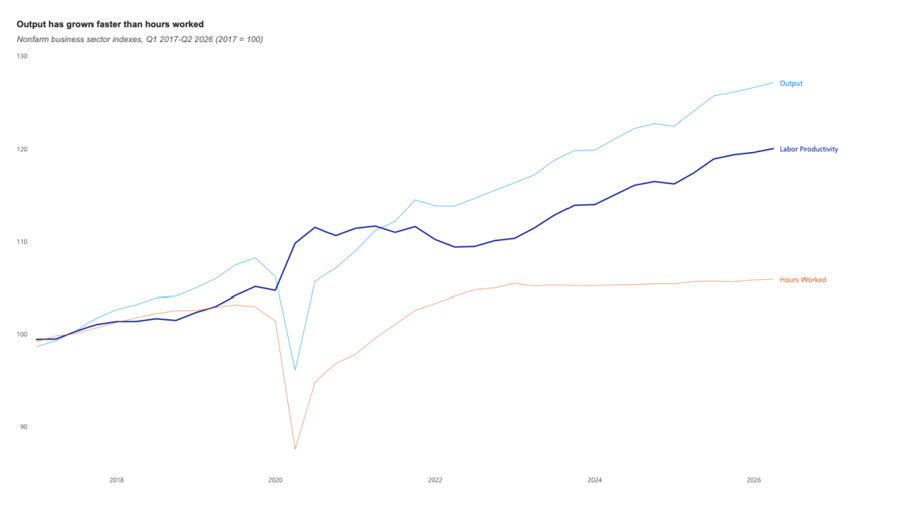
U.S. nonfarm business labor productivity increased at a 1.4 percent annualized rate in the second quarter of 2026, according to the Bureau of Labor Statistics. Output increased 1.7 percent while hours worked increased 0.3 percent. From a year earlier, productivity was up 2.2 percent.

The business lesson is not the macroeconomic forecast. It is the measurement structure. Productivity is useful precisely because it relates an outcome to the resources required to produce it. Many internal dashboards stop at the numerator: sales, tickets closed, projects delivered, customers served. Those totals matter, but they can hide whether the organization became more efficient or simply used more capacity.

A service team that closes 10 percent more tickets while using 15 percent more labor hours increased its output, but not its productivity.

bls.gov


Source: https://www.bls.gov/charts/productivity-and-costs/nonfarm-business-sector-indexes.htm?lv=true

In Data

Three developments worth watching in analytics

1. Power BI projects are becoming more software-like

Microsoft’s September Power BI release moved Power BI Projects (PBIP) to general availability. The format stores report and semantic-model definitions as files and folders, making version control, comparison, deployment, and collaboration more compatible with established development practices. The broader signal is that BI assets are increasingly being managed as maintainable products rather than opaque files passed between people.

• Microsoft, Power BI September 2026 Feature Summary

2. Tableau is slowing the release clock on purpose

Tableau announced a revised product-release cadence on September 30, describing the change as a way to allow more research, testing, and user feedback between releases. For analytics leaders, cadence is not just a vendor detail. Frequent change creates its own operating cost through testing, documentation, training, and governance. A slower cycle can be valuable when stability matters more than novelty.

• Tableau, Product Release Cadence

3. Census is continuing to push business data toward shorter decision cycles

The Census Bureau’s Business Trends and Outlook Survey (BTOS) releases data every two weeks and provides sector, state, and large-metro detail. Its approximately 1.2 million-business sample is designed to provide timely measures of business conditions and expectations. The lesson for internal analytics is similar: useful reporting cadence should be designed around how quickly the underlying decision can change.

U.S. Census Bureau, Business Trends and Outlook Survey Data Release, September 24, 2026 

Actionable Insight

Run a denominator audit on your most important KPIs

Choose five measures leadership relies on and ask the following questions:

  • What is the numerator?

    • What outcome or activity are we counting?

  • What is the denominator?

    • What scale, exposure, capacity, or opportunity should the numerator be compared with?

  • Can either component change independently?

  • Would that change our interpretation of the KPI?

The point is not to convert every total into a ratio. It is to make sure the measure matches the decision. A growing numerator can look like improvement when the underlying efficiency, quality, or conversion rate is flat.


CLOSING

Good analytics is not only about getting the number right. It is about choosing a number whose structure matches the question. The latest productivity data makes that visible at a national scale, but the same principle applies inside a business. Totals show how much happened; denominators often explain what that amount means.

As analytics platforms mature, the surrounding discipline matters too. Manage reporting assets deliberately, adopt change at a pace the organization can absorb, and design reporting cadence around the decisions it supports.

If any of this edition’s topics connect to challenges your organization is working through, we are glad to continue the conversation.


data@work is published by SVA Consulting. Each issue is designed to help business leaders understand what is changing in the data and analytics landscape, why it matters, and what to do with it.

Ready to transform your business?

Let’s chat! Just fill out the short contact form and our team will reach out shortly.
CONTACT US