
It's Monday morning. You open your laptop and your key metrics are already waiting: revenue trending up, margins holding steady, order volume climbing. Each one comes with a trend line with an explanation of what's driving it. You didn't build a dashboard. You didn't ask anyone to pull a report. You didn't even finish your coffee.
This is Tableau Pulse. And it changes what Monday morning looks like.
What is Tableau Pulse?
For 20 years, business intelligence has worked the same way. Someone builds a dashboard. Someone else opens it (maybe). They apply filters, scroll through tabs, and try to figure out what has changed. If they're good at it, they spot something worth acting on. If they're busy, which is everyone, the dashboard sits untouched until the quarterly review.
Tableau Pulse flips this model. It's a feature inside Tableau Cloud that delivers AI-generated insights to business users without requiring them to build or interact with dashboards at all. An admin or analyst defines a metric, something like Total Revenue or Gross Margin, connected to a published data source with a time dimension. Users then follow the metrics they care about, the same way you'd follow someone on LinkedIn.
Pulse does the rest. Behind the scenes, it examines every dimension in the data, runs statistical models, and surfaces the most significant findings as natural-language sentences. Those insights arrive on the Pulse home page, in email digests, and through Slack or Microsoft Teams. Nobody has to remember to check.
In our work with clients, we see this gap frequently. One VP of Sales told us, "I have six dashboards I'm supposed to check every week. I look at maybe two of them, and only when something already feels wrong." The data exists. The dashboards exist. The insights sit undiscovered.
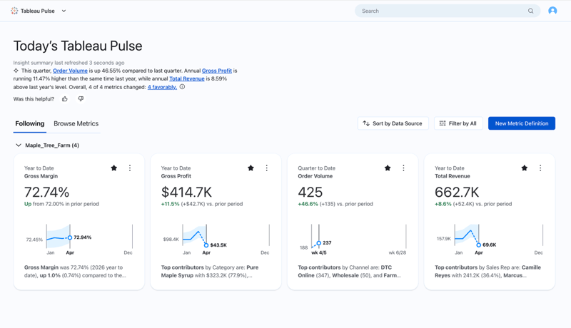
The Home Page: Your Business in One Minute
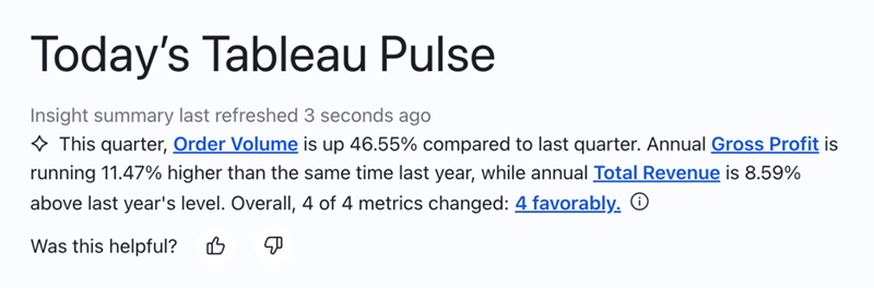
When you open Pulse, the first thing on your screen isn't a chart. It's a plain-English AI summary of what's happening across the metrics you follow. Nobody had to write that summary. It's generated automatically based on what the AI detected in your data.
Below the summary, metric cards sit side by side. Each shows the current value, a comparison to prior period, a sparkline trend, and an auto-generated text insight. Whether you're tracking revenue, customer acquisition, support ticket volume, or inventory turnover, the format is the same: the numbers you care about, pre-analyzed and pre-explained, before you've clicked a single thing.
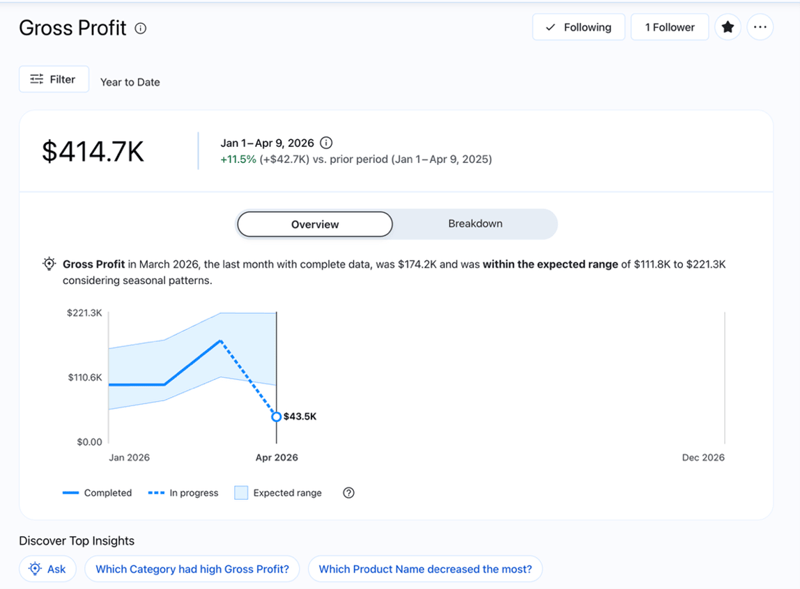
Click any metric card and the story deepens. The detail page shows a larger trend line, comparisons in two directions (versus the prior period and versus the same period last year), and whether the current value falls within the expected range given seasonal patterns. Anything outside that range gets flagged automatically.
Below the trend, AI-generated insight cards surface the most significant findings across every dimension in your data, whether that's by region, product line, customer segment, or channel. You don't ask for those breakdowns. Pulse finds them on its own and ranks them by statistical significance.
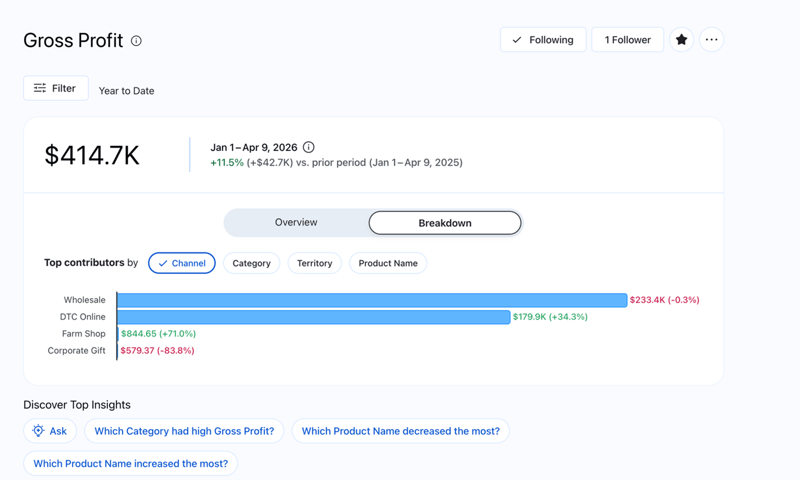
A Breakdown tab lets you see how different dimension values contribute to the total. Want to see the split by territory? Click. By product category? Click. The analysis that used to take 20 minutes in a spreadsheet happens in two clicks. And because it's connected to a live data source, the numbers are always current.
Metrics at the right level, for the right people. Each metric can be viewed at different time granularities: Year to Date, Quarter to Date, or Month to Date. A CFO reviewing annual trends and a regional manager tracking this month's performance can follow the same metric and each see the lens that fits their role.
Pulse also supports adjustable dimensions, which are filters users can toggle to personalize their view. A VP of Sales sees the full picture across all regions. A sales rep sees only their territory.
Same metric, same data source, completely different perspectives, and the access controls ensure each person sees only what they're authorized to see. When a filter is applied, every insight on the page regenerates in real time: new trend line, new comparisons, new explanations.
Ask questions, get answers. Pulse also includes an enhanced Q&A feature. Instead of just reading the insights Pulse surfaces automatically, you can ask your own questions in plain language: "How did the West region perform last quarter compared to this quarter?" or "Which product categories are driving the margin increase?"
The enhanced Q&A analyzes multiple metrics together, identifies shared patterns and outlier trends, and returns an answer with supporting visualizations and source citations. It's a conversational way to go deeper without building a new report or waiting for an analyst to get back to you.
Where Pulse Meets You. The Pulse home page is useful. But the real shift happens when insights travel to the places where people already spend their time.
Tableau Pulse in Microsoft Teams. Tableau offers a dedicated connection for Microsoft Teams that brings Pulse metrics and dashboards directly into the place where most teams already communicate. The app uses Tableau's centralized permissions, so data governance carries over: each person sees only what they're authorized to access.
Pulse on Mobile. Tableau Pulse is also available through the Tableau Mobile app, so you can check your metrics and receive insights on the go.
Alerts and Digests. Pulse doesn't just wait for you to check in. It watches your metrics and alerts you when something crosses into an unfavorable threshold or when a new trend emerges. Those alerts arrive through email, Slack, and mobile push notifications. By default, you get a weekly digest in both Slack and email, but you can adjust the frequency.
Why This Changes Monday Morning
The question most organizations face isn't whether they have enough data. Most are drowning in it. The question is whether the people making decisions are seeing what the data already knows.
Pulse changes the default. Instead of asking people to go find data, data finds them. Instead of requiring dashboard literacy, it delivers plain-English explanations. Instead of hoping someone remembers to check a report, it pushes the most important changes to the tools your team already uses.
Traditional dashboards aren't going away, and they shouldn't. When someone needs to explore a question in depth, build a custom view, or analyze a new dataset, dashboards are the right tool. But for the daily question of "what changed and should I care," Pulse is faster, smarter, and more likely to actually get used.
The teams we work with who adopt Pulse tend to notice something within the first few weeks: the questions change. People stop asking, "What happened last quarter?" and start asking, "Why did this metric move and what should we do about it?" That's a different kind of Monday morning.
Tableau Conference 2026 is happening May 5–7 in San Diego, and SVA will be there. We're looking forward to seeing what's next for Pulse and the broader Tableau ecosystem. If you're attending, we'd love to connect. See more details here.
